Why & How to Create a Custom 404 Page on Your Squarespace Website
Don’t let a valuable patch of space on your website go to waste!
Every page on your website should serve a purpose; whether its building trust with your audience through an engaging About page, displaying your skills in a Portfolio, or showing people how you can help them and why they need you on your Services page. But there’s one page that regularly gets left out and often ends up serving not function at all - what a waste!
It’s your 404 page.
What is a 404 page & when does it appear?
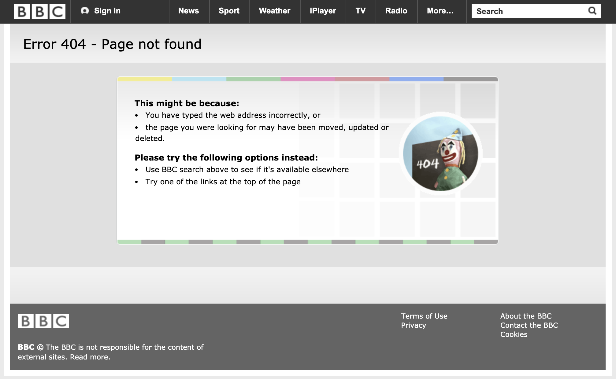
A 404 page is the webpage that’s shown when a ‘HTTP 404 error’ occurs. This error means that the page you have clicked through to doesn’t exist anymore - you’ll often see them with the text ‘404 - Page not found’ on them.
These errors happen when you have ‘broken links’ either on your site or somewhere on the internet. A broken link just means that after the link has been set up for people to click on, the URL for that page has changed or the page has been deleted, so the link no longer works.
The 404 page appears letting the user know there’s been an error, and it actually happens pretty regularly! I’m sure you’ve probably come across them before.
How to avoid broken links & 404 errors:
So as much as I advocate for customising your 404 page as I’ll explain below, your goal should always be to make sure it doesn’t appear for people, as it’s still an inconvenience for your website visitors. To avoid 404 errors and broken links:
Don’t change page URLs without setting up 301 redirects
Don’t delete pages without setting up a 301 redirect to a different, relevant page
Perform a website audit and check for any existing broken links on your site
Set up 301 redirects if you move websites / change domain
Why is customising your 404 page important?
Most website’s have a default 404 page template which literally just says ‘404 - Page not found’, which isn’t really any use to anybody! As I mentioned above, all your website pages need to have a function and a purpose, including this one. Why?
Have visitors know what to do next
Have another way of building brand recognition
Improve your website’s ‘bounce rate’ (keep people on your website for longer - and this is good for SEO)
Increase your conversions (product sales, email sign ups, or contact enquiries!)
Below is an example of mine if people do come across it:
How to edit your 404 page in Squarespace:
Creating a custom 404 page in Squarespace couldn’t be simpler!
First, create a new page and name it ‘404’ (although can technically call it anything you like!) and use the tips below to fill it with content.
When you’re ready, head to your dashboard and go to Design > Not Found / 404 Page. Here, you can select the page you wish to display as your custom 404 page from a dropdown. Click save and it’s all done!
What could you include on your 404 page?
An apology
First of all, it’s important to take the blame and apologise to your website visitor, who might be feeling frustrated that they haven’t been able to access the page they were linked to. You can do this with professional sincerity, or with humour, depending on what works with your brand voice and personality!A search bar
This is the best thing to include on a 404 page because it gives users the chance to find the correct page rather than give up on the content they wanted to see.Get across your brand personality in the copy
As mentioned above, your 404 page is a great opportunity to get across your brand personality, as it shows users how your business deals with a ‘fail’. Whether you’re very gracious about it, or use humour and puns to win back their trust, this a great place to get creative.Branded illustrations or graphics
As I say, this is a regularly under-utilised space to build up some brand recognition, so why not create a custom 404 or ‘page not found’ graphic or illustration that helps say more about your brand.Suggested content
As well as a search bar, you could suggest popular content on your site that visitors might also be interested in. This helps them stay on your site and gives them a bit more of a flavour of what your business is about if this is the first interaction they’re having with your brand. On mine, I have a list of recent blog posts, so they can see the kind of content I create.A call to action or sign up form
If you’ve recently launched something that you’re focusing on promoting, or have an irresistible opt-in freebie for your email list sign ups, then this could be a great opportunity to catch more conversions! Be careful not to come across as too pushy though, remember users on this page might be feeling frustrated so it’s best to take a soft approach.
Examples of good custom 404 pages:
Everyone knows Mailchimp for being a humorous, light-hearted brand with its quirky animal illustrations and friendly tone.
Their 404 page not only takes responsibility for the error, it also features a humorous, on-brand illustration too.
This quirky brand has used language to portray its vintage feel, and has used a custom illustration to make the page more interesting too.
As well as this, they have included ‘suggested content’ to keep the user engaged.
I absolutely love the custom 404 page travel blog, The Blonde Abroad, have created. It’s super on-brand (with travel references such as ‘you’re lost’ and ‘refer to the map to get back on track’), features a search bar AND a tonne of suggestion content that is displayed in a beautiful, engaging way.
Love it!


